COHERE for REBA HOLDINGS
Hampden Wormark
My favorite project working at Cohere was developing a wordmark for the Hampden neighborhood. The project is ongoing, therefore the presentation below shows four options most recently prepared to present to the client.
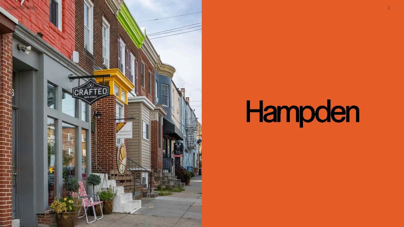
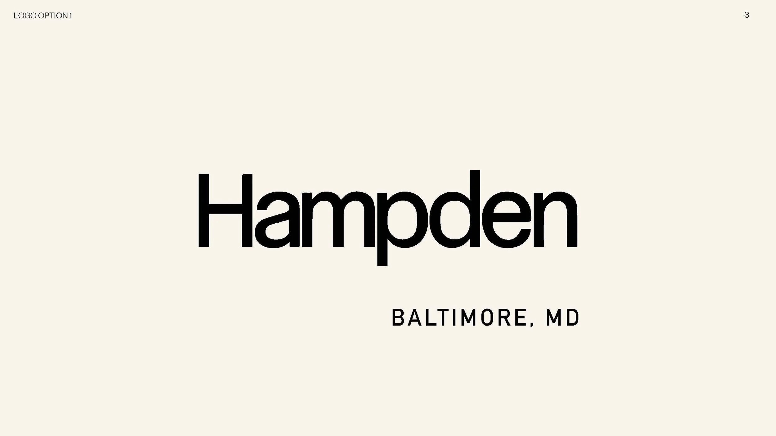
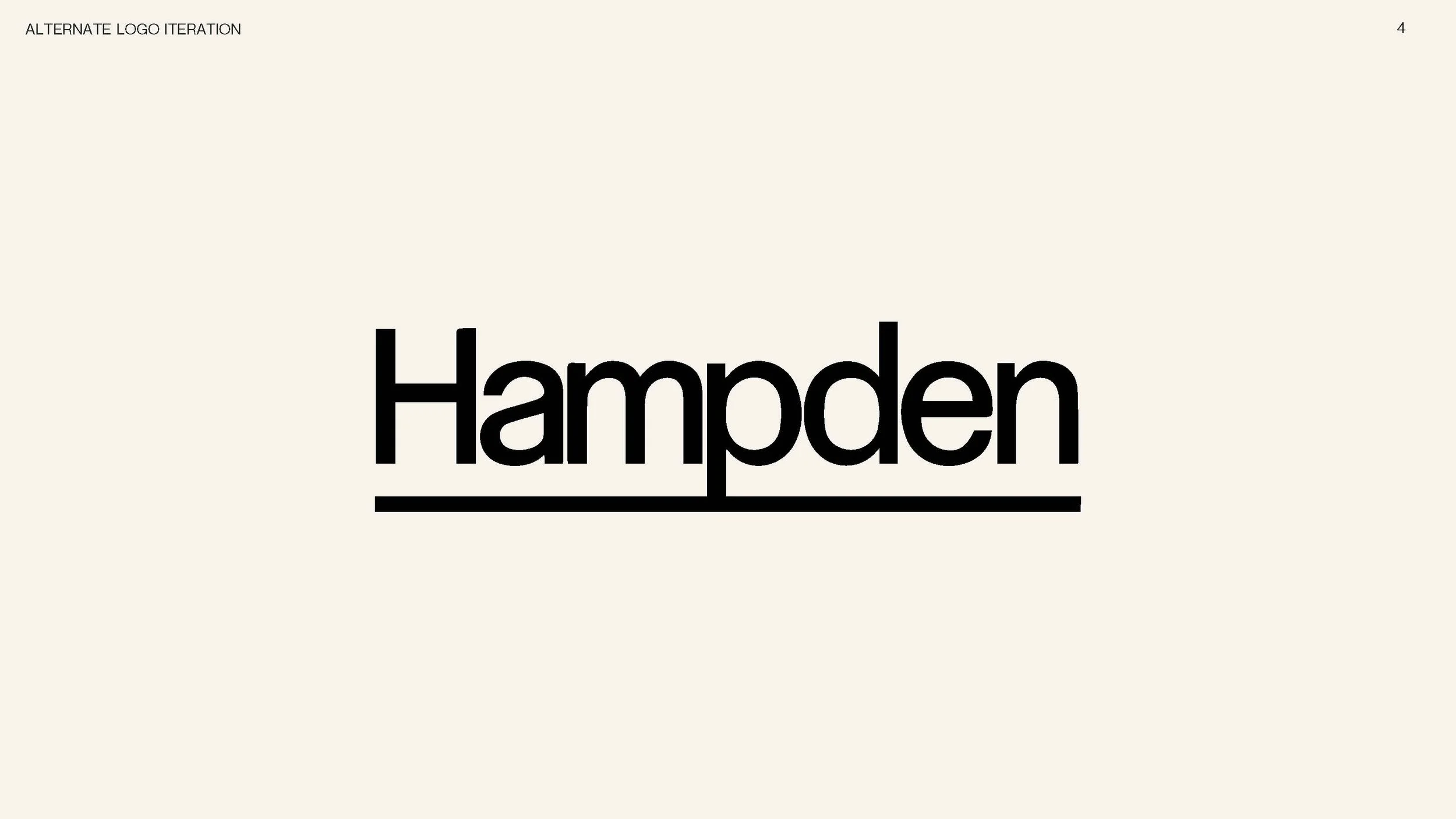
OPTION 1 : A classic modern typeface to speak to the clientele coming into Hampden in droves as of late. Hampden’s grown is apparent to the community and this wordmark is meant to encourage and set up the neighborhood to maintain that growth in a spectacular way.
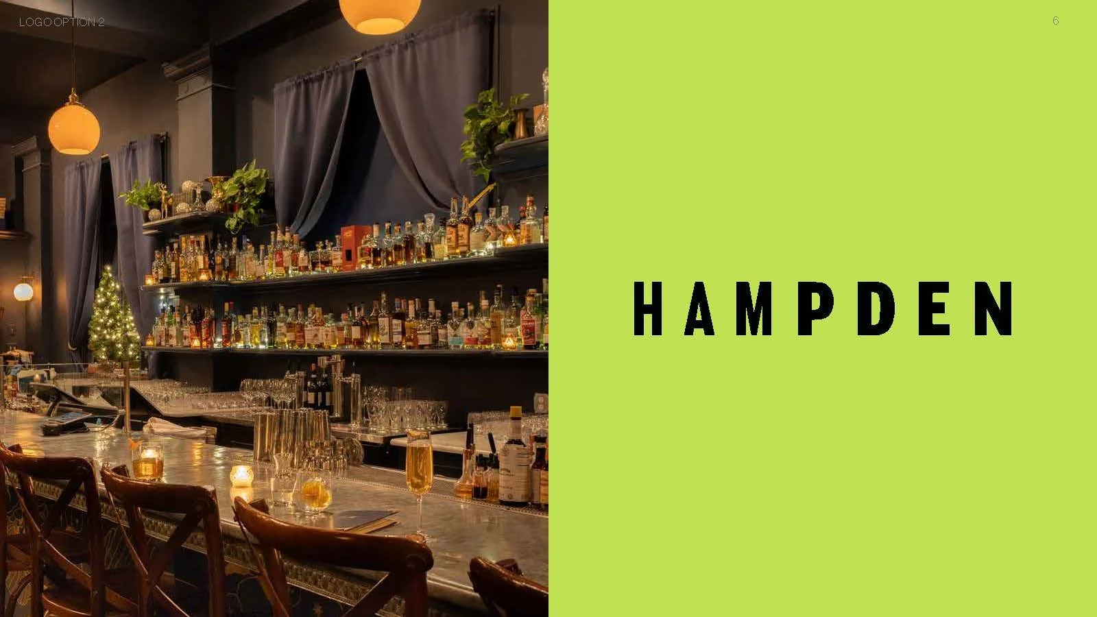
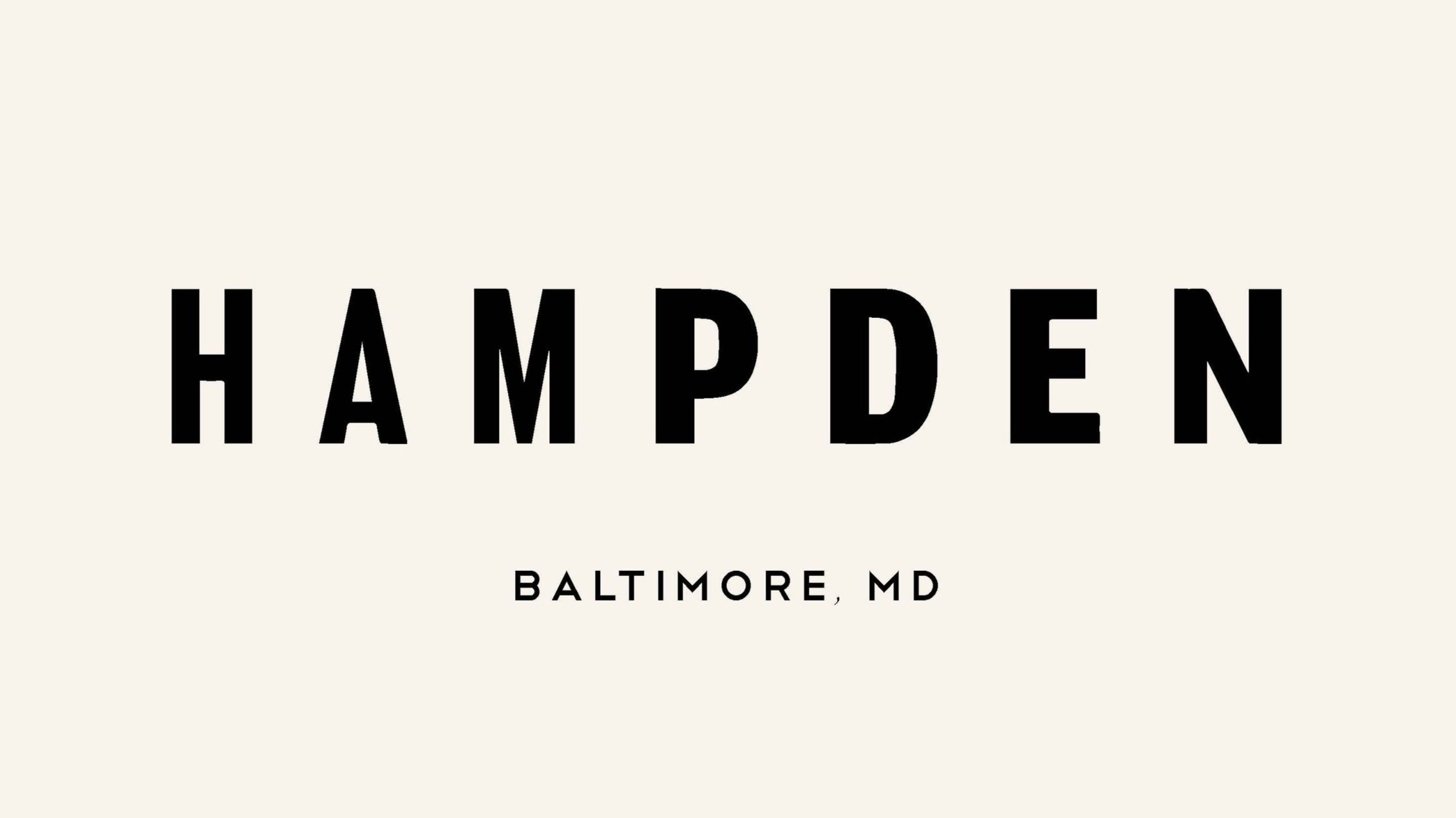
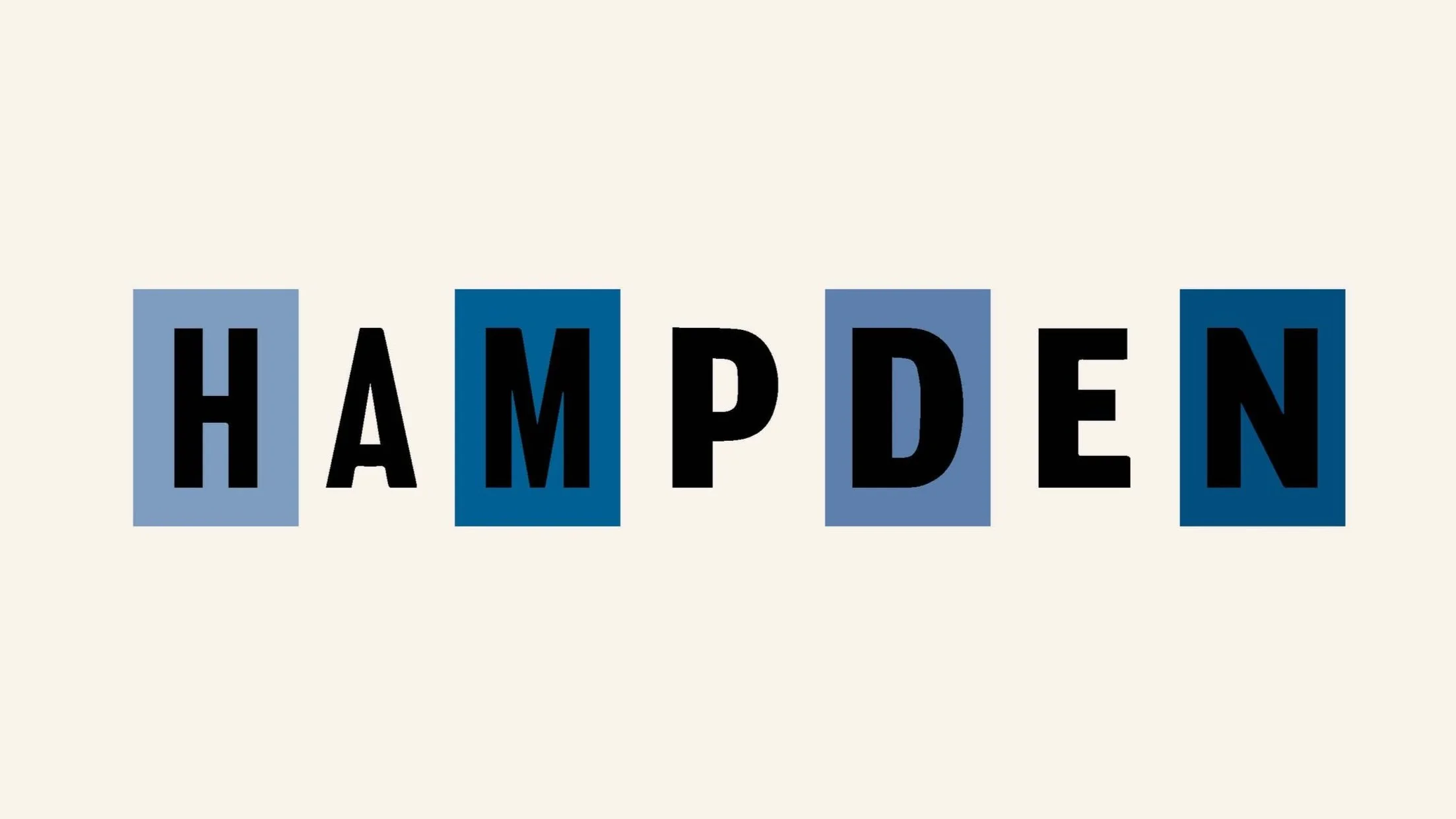
OPTION 2 : This wordmark was created to evoke that classic grungey vibe that Hampden residents and visitors hold dear to their hearts. The varying line weights are a dynamic element that are subtle, yet extremely expressive to the underlying message. The option showing blocks behind are reminiscent of a vintage flyer or poster that one may see lining the telephone poles all up and down the ave.
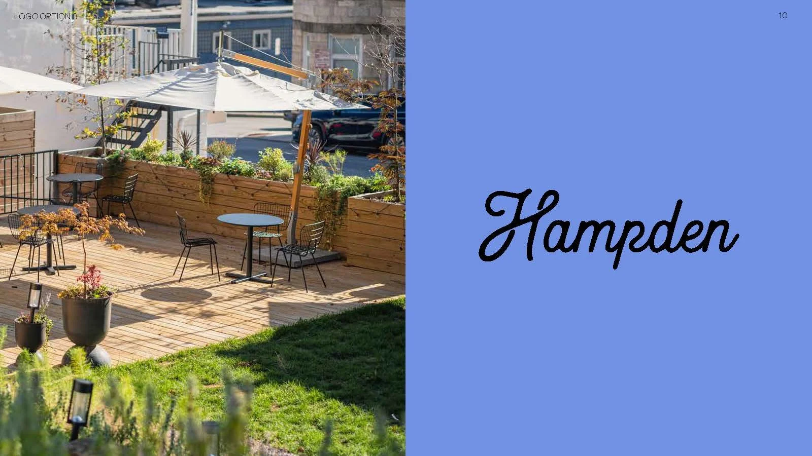
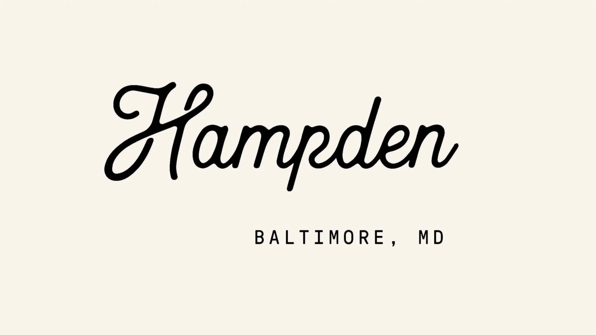
OPTION 3 : Developed to put a sophisticate playful spin on the neighborhood’s identity, this wordmark adds an inviting, vintage element. This wodmark also translates beautifully to a lettermark with a pronounced and dynamic “H”. The nono subtype grounds the whimiscal mark and places the viewer in the context of Hampden.
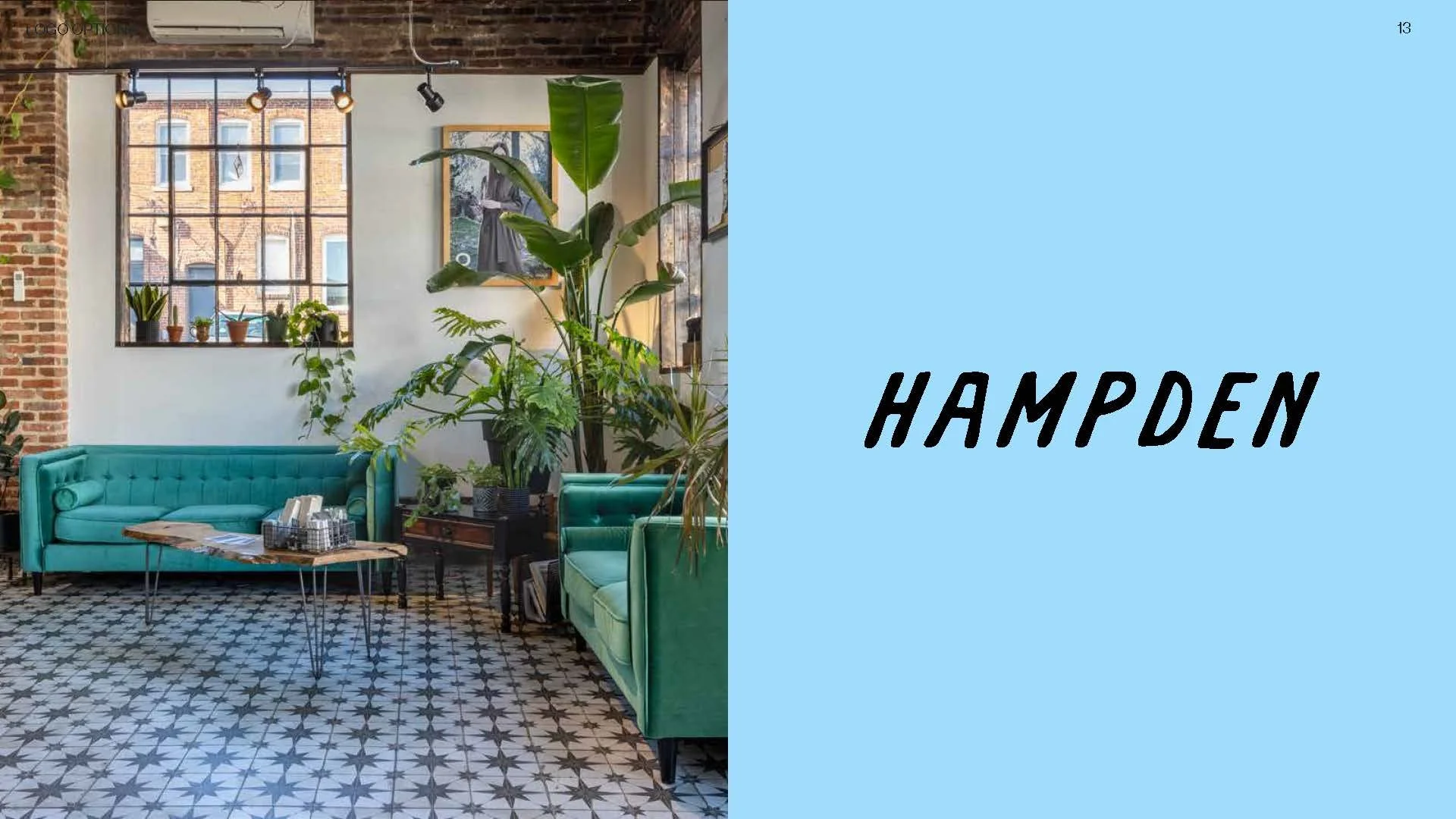
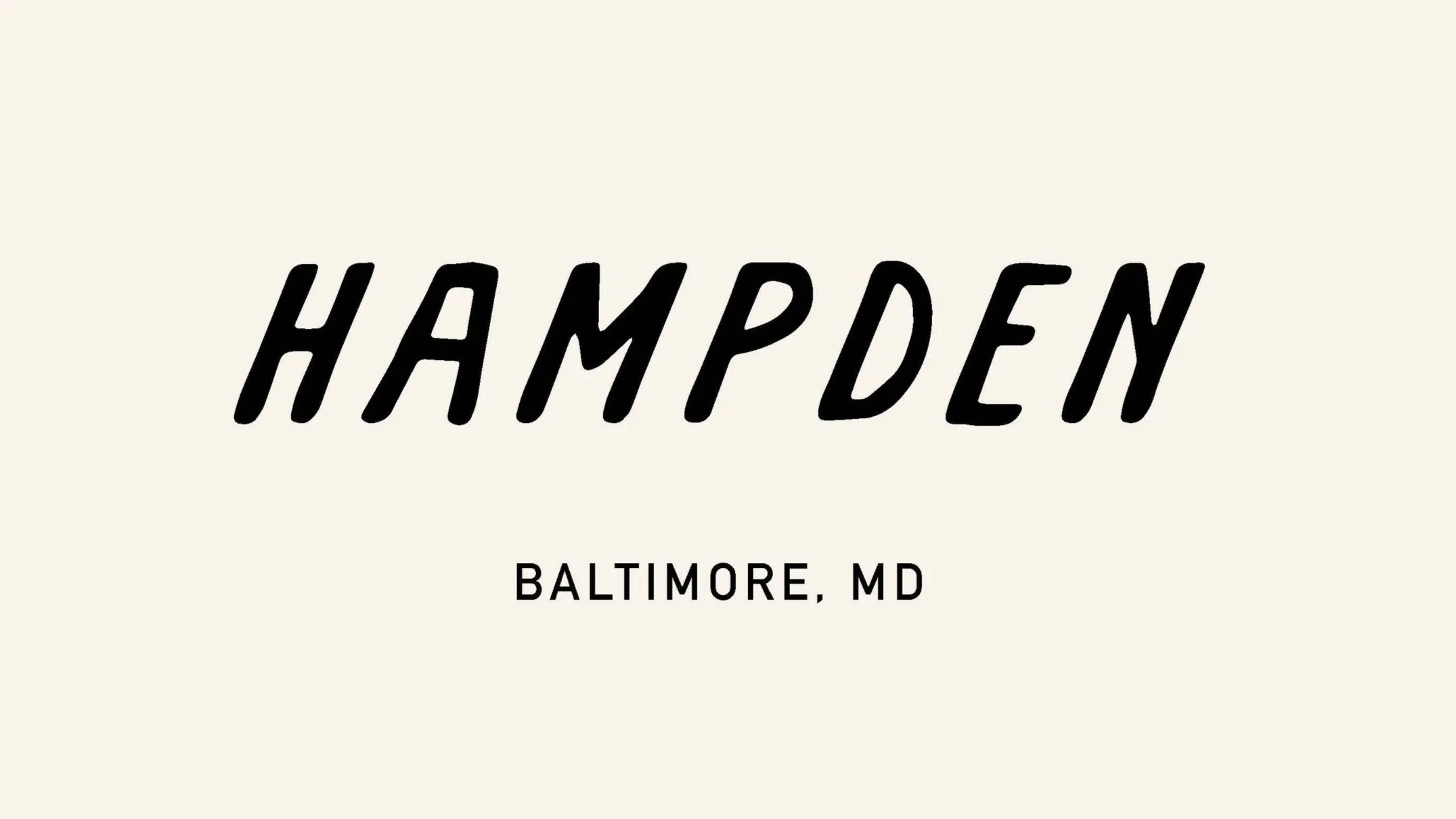
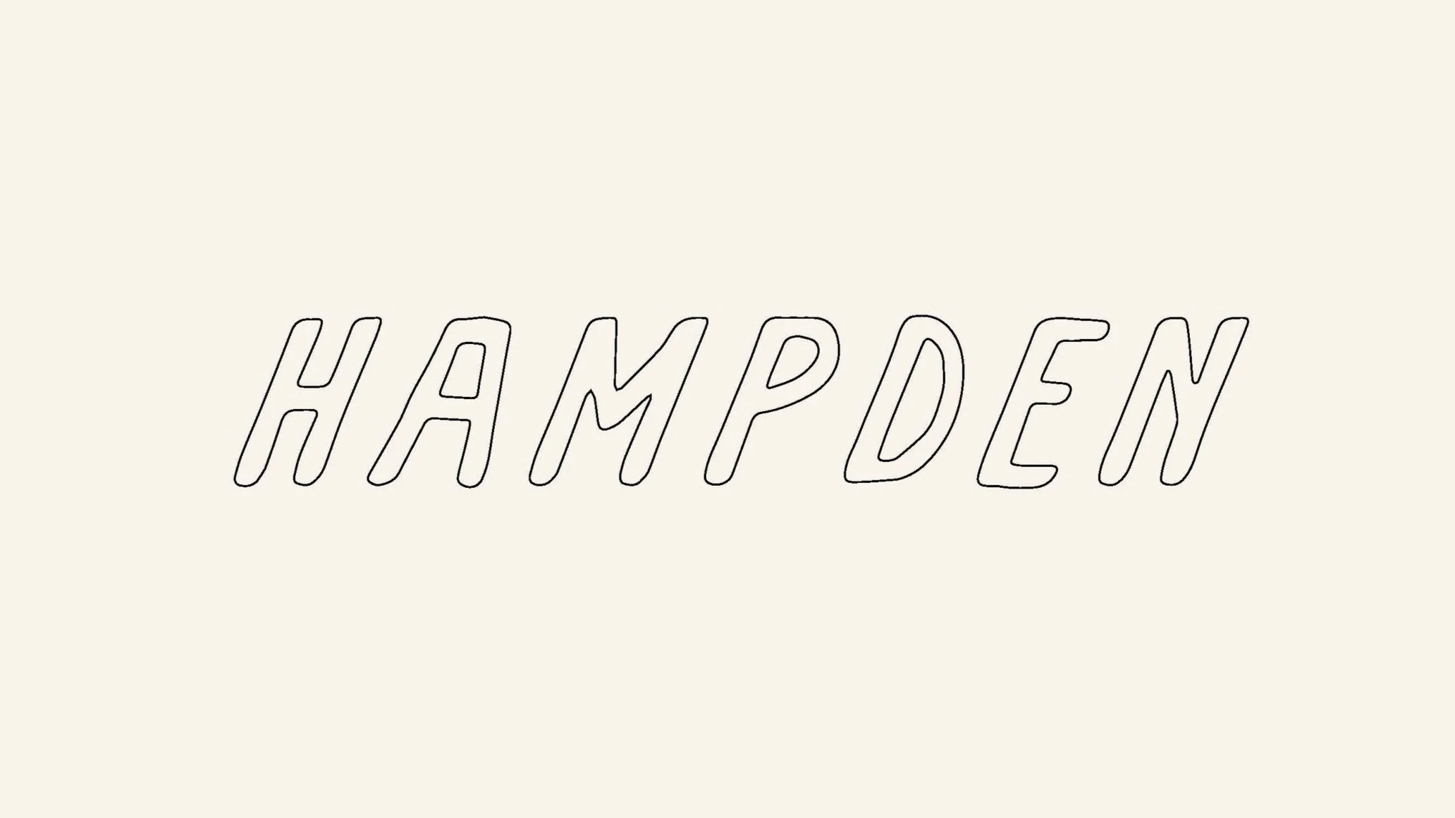
OPTION 4 : This fourth and final option is my personal favorite. The hand-done nature of the typeface used, especially in the outlined version, fits the personality of the Hampden neighborhood in an exceptional way. Quirky, simple and cool. Each line is intentional. The uppercase letters and the complimenting san serif all fit the nature of what this wordmark should be. I envision this wordmark over numerous medias, however, it’s soundness in it’s digital display is undeniable.